Welcome to Chartify, the ultimate AI-powered solution for turning data into compelling visual narratives. Are you tired of sifting through complex data and struggling to present it effectively? Chartify is here to change that. As an AI-driven chart and graph generation tool, Chartify is designed to simplify the process of data visualization. Here's how it works:
-
What is Chartify? Chartify is an innovative AI tool that allows users to generate charts and graphs from data using natural language queries. Its purpose is to make data visualization accessible to everyone, regardless of their technical expertise. By providing a value proposition that emphasizes ease of use and efficiency, Chartify empowers users to quickly transform raw data into insightful visual representations.
-
How to use Chartify?
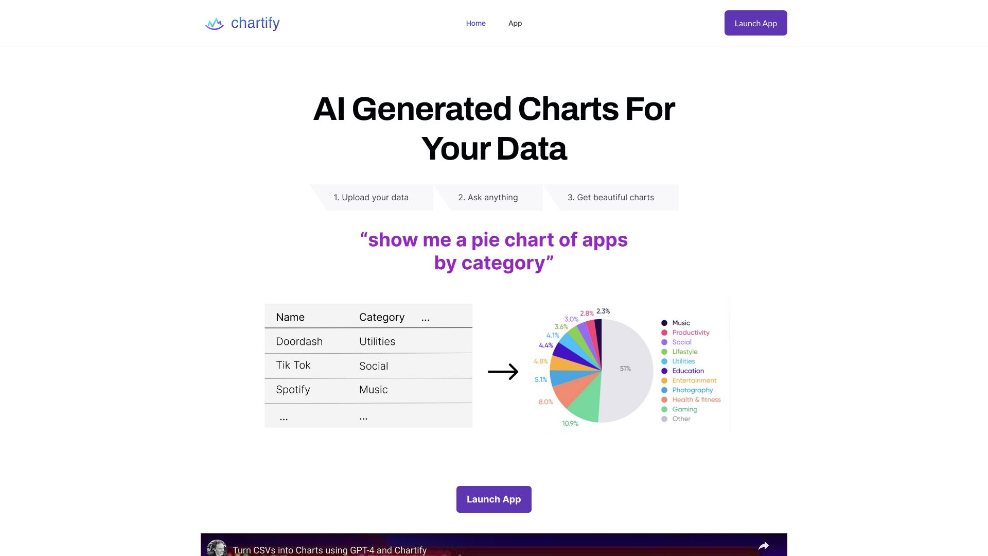
 Using Chartify is straightforward. Simply input your data, whether it's in a spreadsheet or a database, and use natural language to describe the type of chart or graph you want to create. Chartify's AI algorithms will then process your request and generate the visual content in real-time. This user-friendly workflow ensures that anyone can create professional-looking charts and graphs without the need for technical skills.
-
Core features of Chartify? Chartify offers a range of powerful features that make it a standout tool in the data visualization space. Key functionalities include:
- Natural language query input
- Support for various chart types, including line graphs, bar charts, pie charts, and more
- Customization options to tailor the appearance of your charts
- Integration with popular data sources and file formats
- Real-time generation and easy export options
With Chartify, you can unlock the full potential of your data and communicate your insights more effectively. Don't let data visualization be a barrier to your success—try Chartify today and see the difference it can make in your data storytelling journey.
