Welcome to the future of data analysis and visualization with ChartPixel! Are you tired of sifting through mountains of data without clear insights? ChartPixel is here to change that. This AI-powered platform is designed to simplify the complex process of data analysis, turning raw information into visually engaging and actionable insights.
What is ChartPixel? It's an all-in-one solution for anyone who wants to make sense of their data quickly and efficiently. Whether you're a seasoned data analyst or just starting out, ChartPixel's intuitive interface makes it easy to understand and utilize its features. Its purpose is clear: to provide you with the tools and insights needed to make informed decisions, whether for business strategy, market research, or personal projects.
How to use ChartPixel?
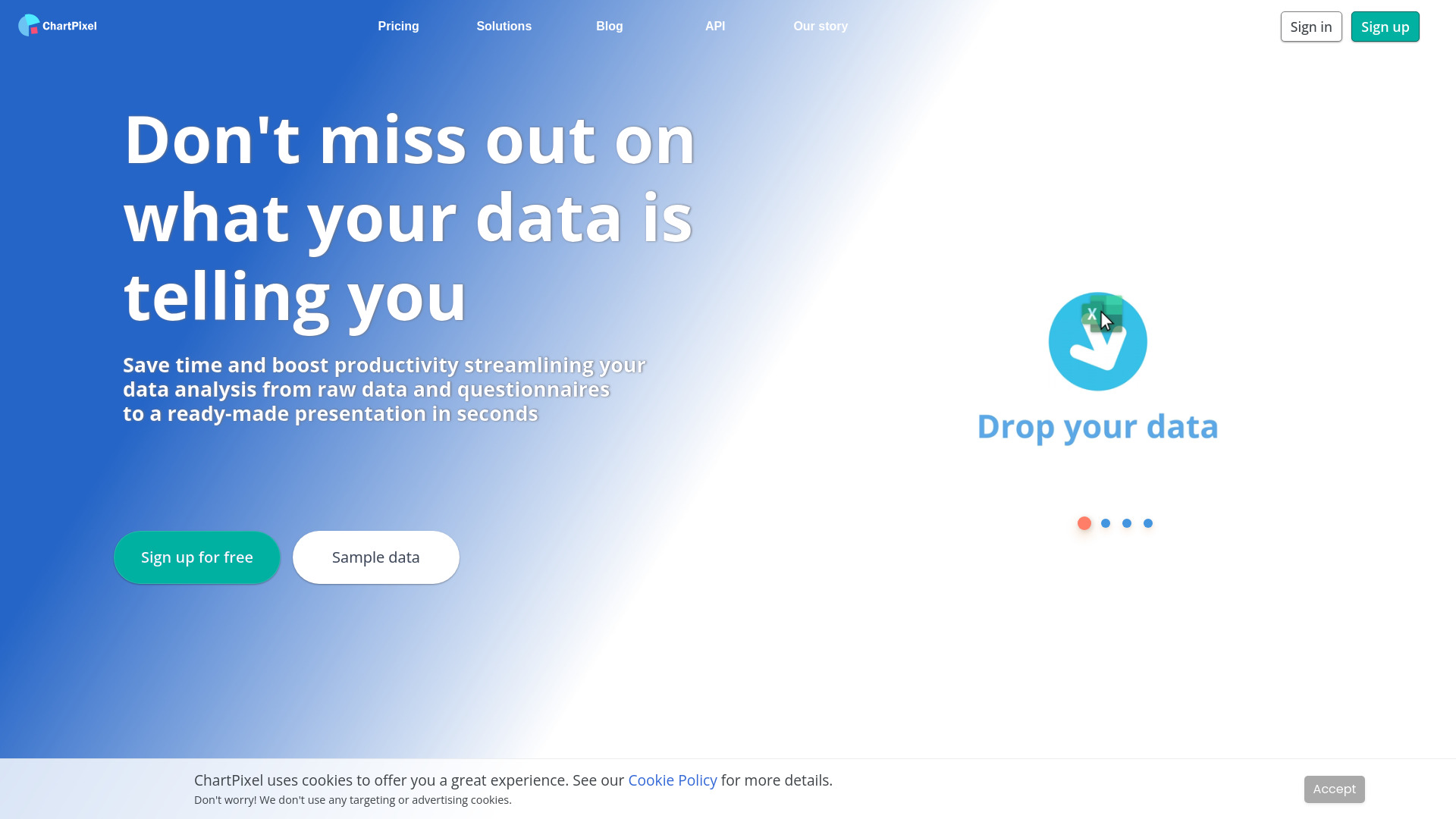
 The process is straightforward. Begin by importing your data, which can be in various formats such as CSV, Excel, or directly from a database. ChartPixel's AI then takes over, analyzing your data and presenting it in a variety of chart types, from bar graphs and pie charts to more complex visualizations like heat maps and scatter plots. You can easily customize these charts to suit your needs, and with the real-time dashboard feature, you can monitor your data as it evolves.
Core features of ChartPixel include automated data analysis, which saves you time by identifying trends and patterns that might otherwise go unnoticed. The real-time visualization allows you to keep a pulse on your data, making it ideal for monitoring key performance indicators (KPIs) and market trends. Additionally, the customizable dashboards provide a personalized view of your data, making it easy to share insights with your team or stakeholders.
Don't let data analysis be a barrier to success. With ChartPixel, you can unlock the full potential of your data and gain a competitive edge. Try it today and experience the power of AI-assisted data analysis and visualization for yourself. Your journey to data-driven decision-making starts here.

