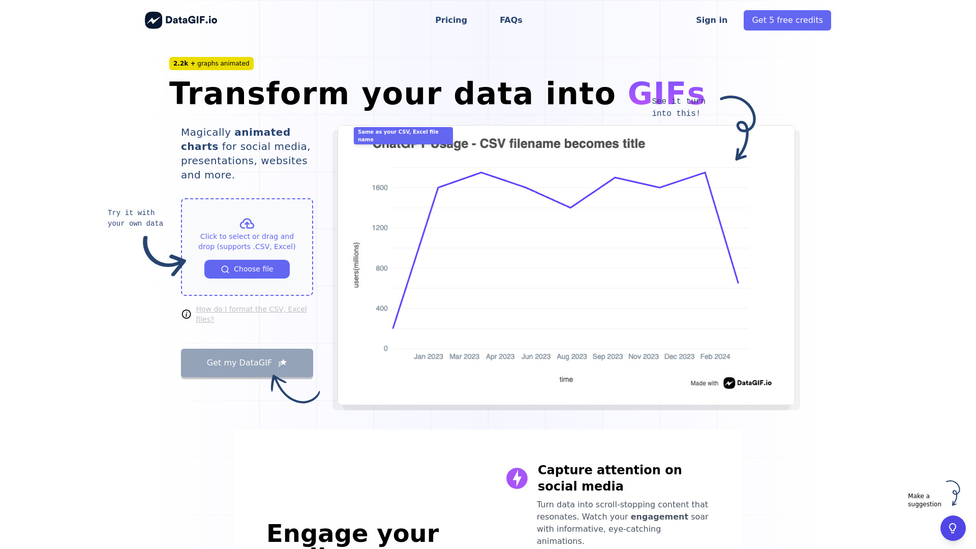
Are you looking to breathe life into your data with engaging animations? Meet DataGIF, the go-to AI-powered animated chart generator for professionals across various fields. DataGIF is more than just a tool; it's a game-changer for anyone seeking to convey information in an impactful and memorable way.
What is DataGIF? DataGIF is an innovative tool designed to simplify data visualization. It transforms raw data into captivating, animated charts that are perfect for social media, websites, and presentations. By harnessing the power of AI, DataGIF allows users to create high-quality, visually compelling content effortlessly.
How to use DataGIF? Using DataGIF is a straightforward process. Begin by importing your data, then choose from a variety of chart types, including bar graphs, pie charts, and line graphs. Customize your design with a range of color schemes, fonts, and animation styles. Once you're satisfied, export your chart as an animated GIF, video, or static image. DataGIF's intuitive workflow ensures that even those without a background in design can create professional-looking charts in no time.
Core features of DataGIF?
- AI-Powered Data Visualization: DataGIF leverages advanced AI algorithms to analyze and interpret your data, ensuring accurate and insightful visual representations.
- Customizable Design Options: With a vast array of customization features, users can tailor their charts to match their brand or personal style.
- Ease of Integration: DataGIF charts are easily embeddable on websites, social media platforms, and presentations, allowing for seamless integration into your existing content.
- Cross-Platform Compatibility: Whether you're working on a Mac or PC, DataGIF supports a wide range of devices, ensuring accessibility for all users.
Don't let your data go unnoticed. Try DataGIF today and take your data storytelling to the next level. Visit our website to sign up for a free trial and start creating animated charts that stand out from the crowd.

