
What is Graphy?
Graphy is an intuitive data visualization tool designed for everyone, from beginners to professionals. It transforms complex data into stunning, interactive graphs in minutes, making it perfect for creating presentations, reports, and social media content. The application democratizes data storytelling by providing an accessible platform that bridges the gap between raw data and compelling narratives, enabling users to communicate information effectively and make data-driven decisions with confidence.
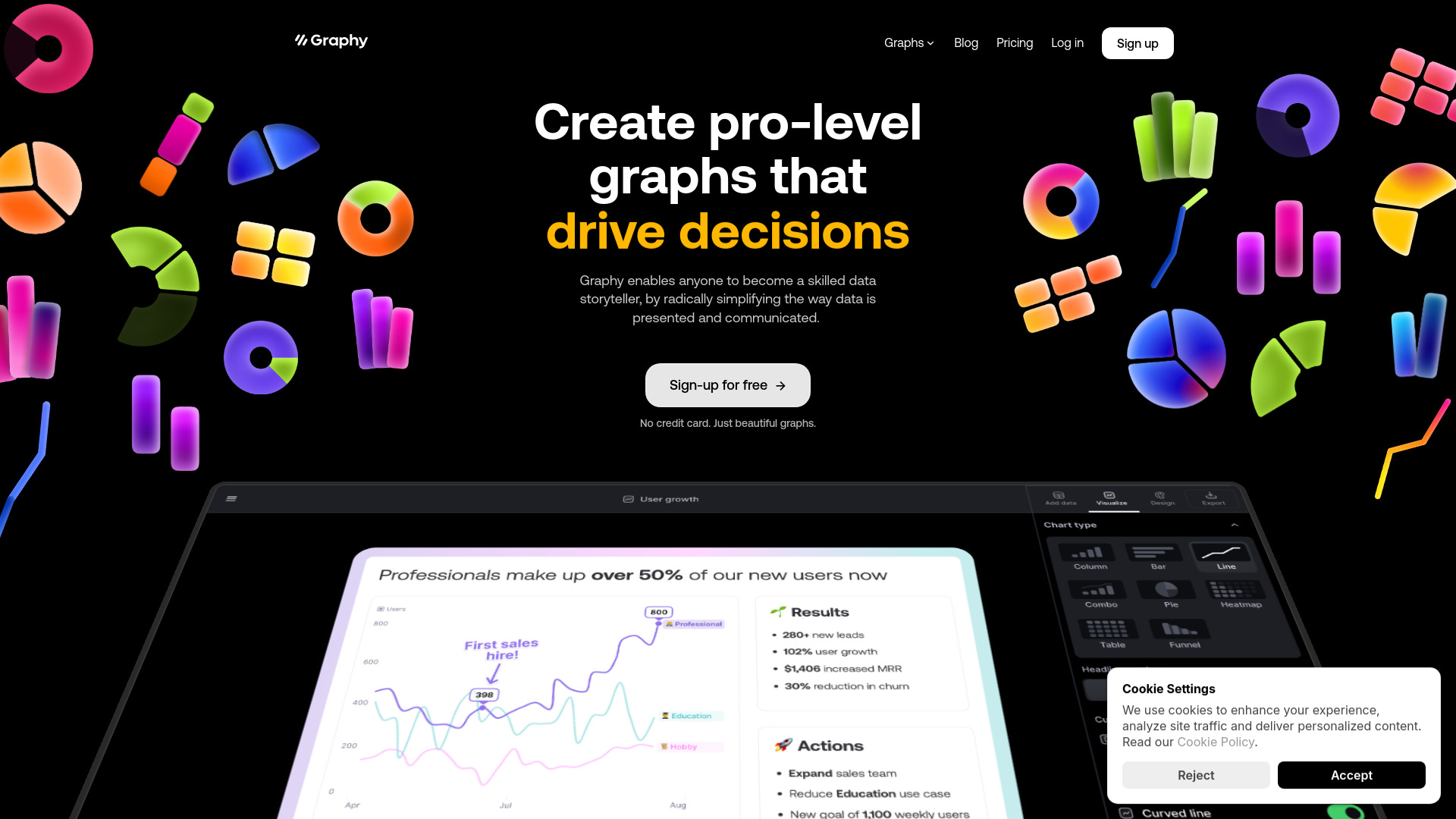
How to use Graphy?
Start by importing your data through seamless integration with Excel, Google Sheets, or CSV files. Select from over 20 chart types that best represent your data story, then customize your visualization using the drag-and-drop interface. Adjust colors, labels, and animations to match your brand or presentation style. Once complete, share your interactive graphs directly to various platforms or collaborate with team members in real-time, streamlining your workflow from data collection to final presentation.
Core features of Graphy?
- Vast Chart Library: Choose from 20+ chart types including bar graphs, pie charts, heat maps, and scatter plots to find the perfect visualization for any data set.
- Advanced Customization: Personalize graphs with themes, color palettes, and layout options to create visually striking representations that stand out.
- Interactive Elements: Enhance engagement with hover effects, tooltips, zoom capabilities, and dynamic data updates that bring your visualizations to life.
- Real-time Collaboration: Work simultaneously with team members, share feedback, and track changes in real-time for efficient project management.
- Multi-platform Export: Export your graphs in various formats including PNG, PDF, and interactive web versions for seamless sharing across different mediums.